
Red
The best Red portfolio websites
Explore red portfolio websites with strong accents and decisive color palettes. Curated design inspiration for creatives who want a clear point of focus.
New portfolios in your inbox.
Red
The best Red portfolio websites
Explore red portfolio websites with strong accents and decisive color palettes. Curated design inspiration for creatives who want a clear point of focus.
New portfolios in your inbox.
Red
The best Red portfolio websites
Explore red portfolio websites with strong accents and decisive color palettes. Curated design inspiration for creatives who want a clear point of focus.
New portfolios in your inbox.










Using red without overwhelming the page
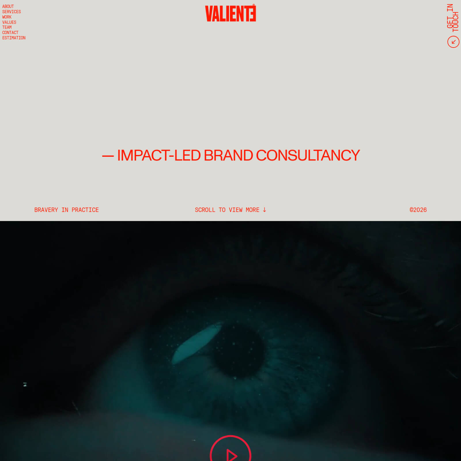
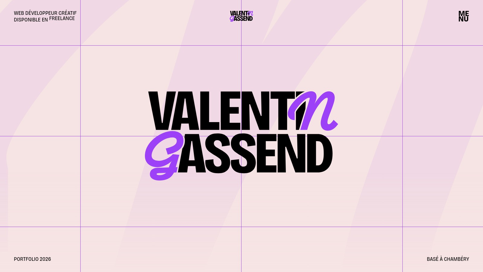
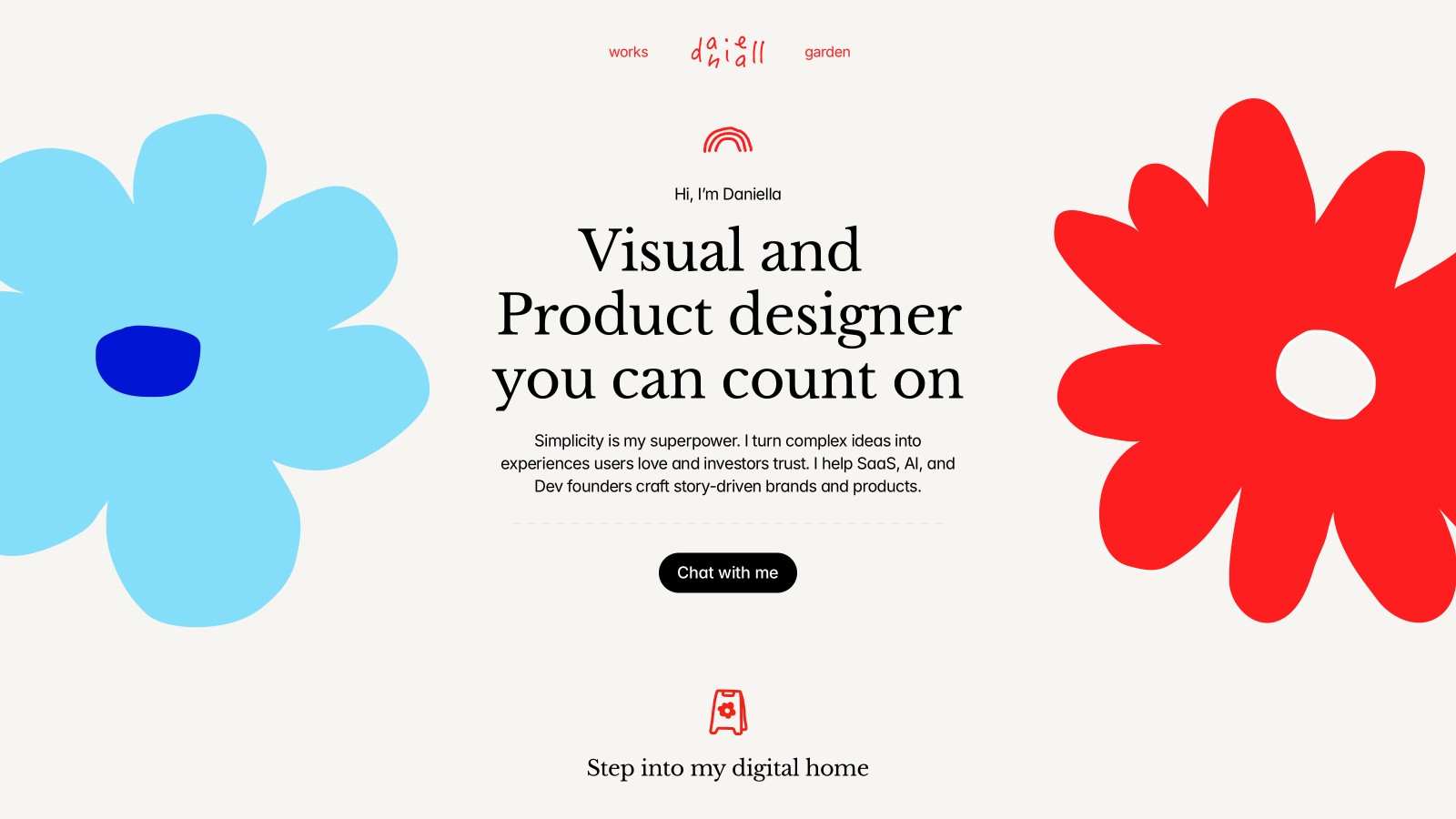
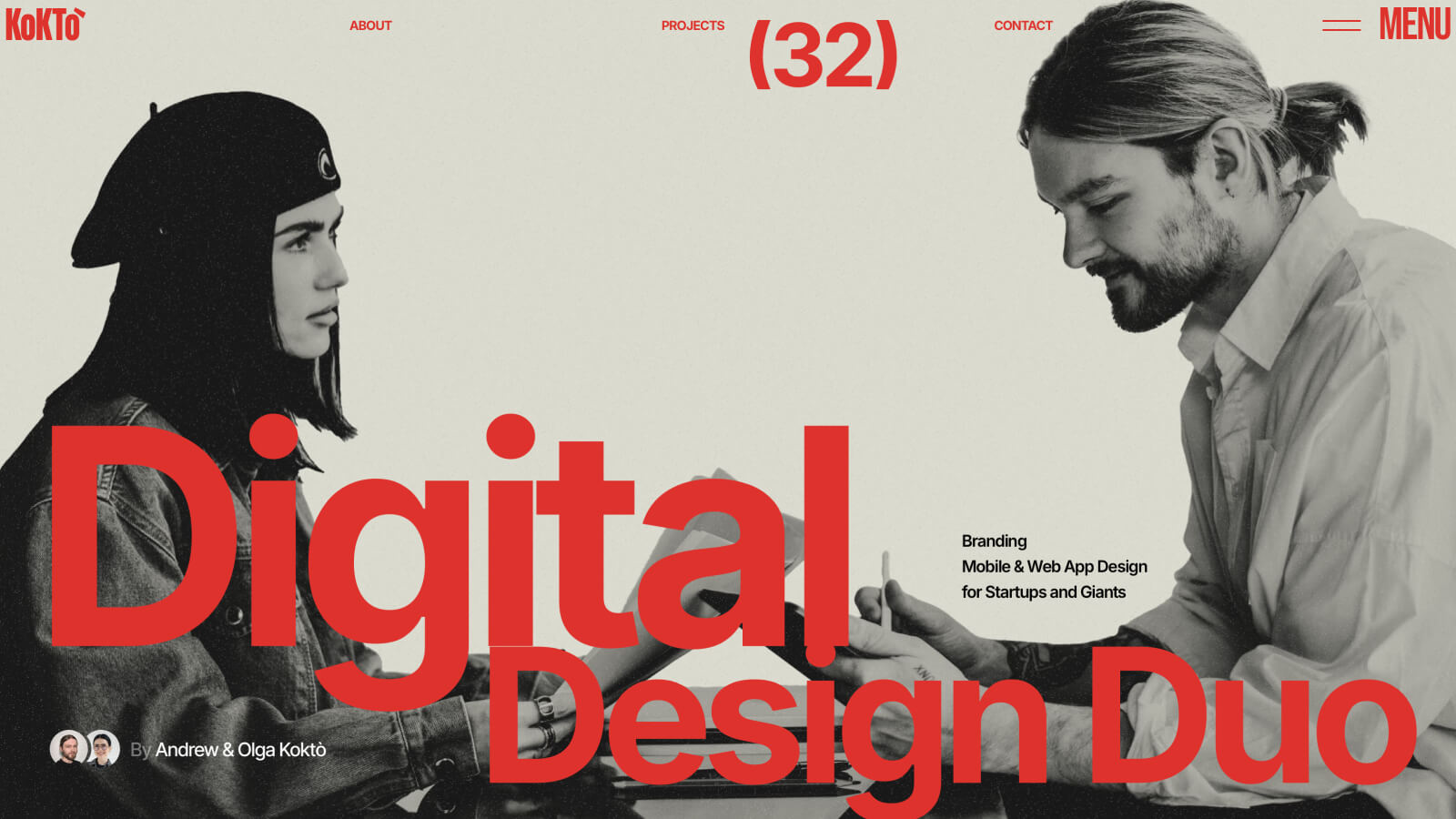
Red website design can establish a strong identity with surprisingly little color. A headline, navigation detail, or large graphic may be enough. The key is deciding whether red represents the brand or signals an action, then applying that decision consistently. If it fills every area at the same intensity, the page loses the contrast that made the color useful.
Red websites worth studying
Kokto places large red typography over a restrained, neutral visual treatment. Alberto Oviedo also uses red lettering on a white canvas, with photography bringing another layer of color. Study the typography separately from the images: the interface needs a coherent palette even when the displayed project changes. These examples are especially useful for understanding red as a graphic element rather than only a button color.
Balancing intensity and clarity
Neutral backgrounds can give red room without adding more competing hues. Small red text still needs a contrast check, particularly on dark surfaces. Browse white websites for lighter foundations, or explore bold portfolios for related approaches to scale. Keep error messages and other important states distinguishable by wording or symbols, rather than expecting visitors to interpret red alone.