
Light grey
The best Light grey portfolio websites
Browse light grey portfolio websites with soft backgrounds and subtle contrast. Curated examples that give typography, images, and project cards room to breathe.
New portfolios in your inbox.
Light grey
The best Light grey portfolio websites
Browse light grey portfolio websites with soft backgrounds and subtle contrast. Curated examples that give typography, images, and project cards room to breathe.
New portfolios in your inbox.
Light grey
The best Light grey portfolio websites
Browse light grey portfolio websites with soft backgrounds and subtle contrast. Curated examples that give typography, images, and project cards room to breathe.
New portfolios in your inbox.




Using light grey as a website foundation
Light grey website design offers an alternative to a bright white canvas without making color the main event. It can separate a page background from white cards, soften large empty areas, or support a restrained editorial layout. The difference between surfaces can be subtle, so spacing and typography still need to carry the hierarchy. A barely visible border should not be the only thing holding a layout together.
Light grey portfolios worth studying
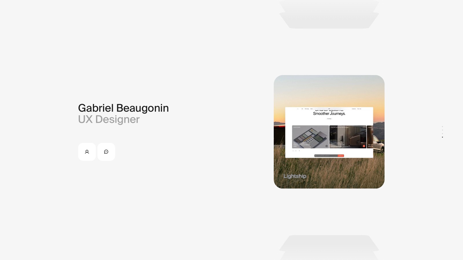
Sacha Haouzi uses pale surfaces around project cards, with darker navigation providing a clear point of orientation. Gabriel Beaugonin keeps the surrounding interface similarly quiet so the featured work can take focus. Study how these backgrounds interact with white elements: the effect depends on the whole composition, not on a single shade.
Keeping a neutral palette readable
Use darker text for essential information and reserve lighter tones for genuinely secondary details. If you want a cleaner contrast between content and background, compare white portfolio websites. For a more pronounced neutral palette, see grey website designs. Light grey works particularly well when you need several surface levels but do not want a collection of competing accent colors.