
Green
The best Green portfolio websites
Discover green portfolio websites with earthy tones, vivid accents, and confident contrasts. Curated inspiration for bringing green into creative web design.
New portfolios in your inbox.
Green
The best Green portfolio websites
Discover green portfolio websites with earthy tones, vivid accents, and confident contrasts. Curated inspiration for bringing green into creative web design.
New portfolios in your inbox.
Green
The best Green portfolio websites
Discover green portfolio websites with earthy tones, vivid accents, and confident contrasts. Curated inspiration for bringing green into creative web design.
New portfolios in your inbox.








Working with green in a portfolio
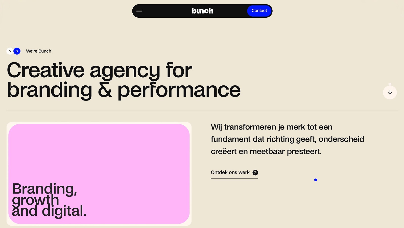
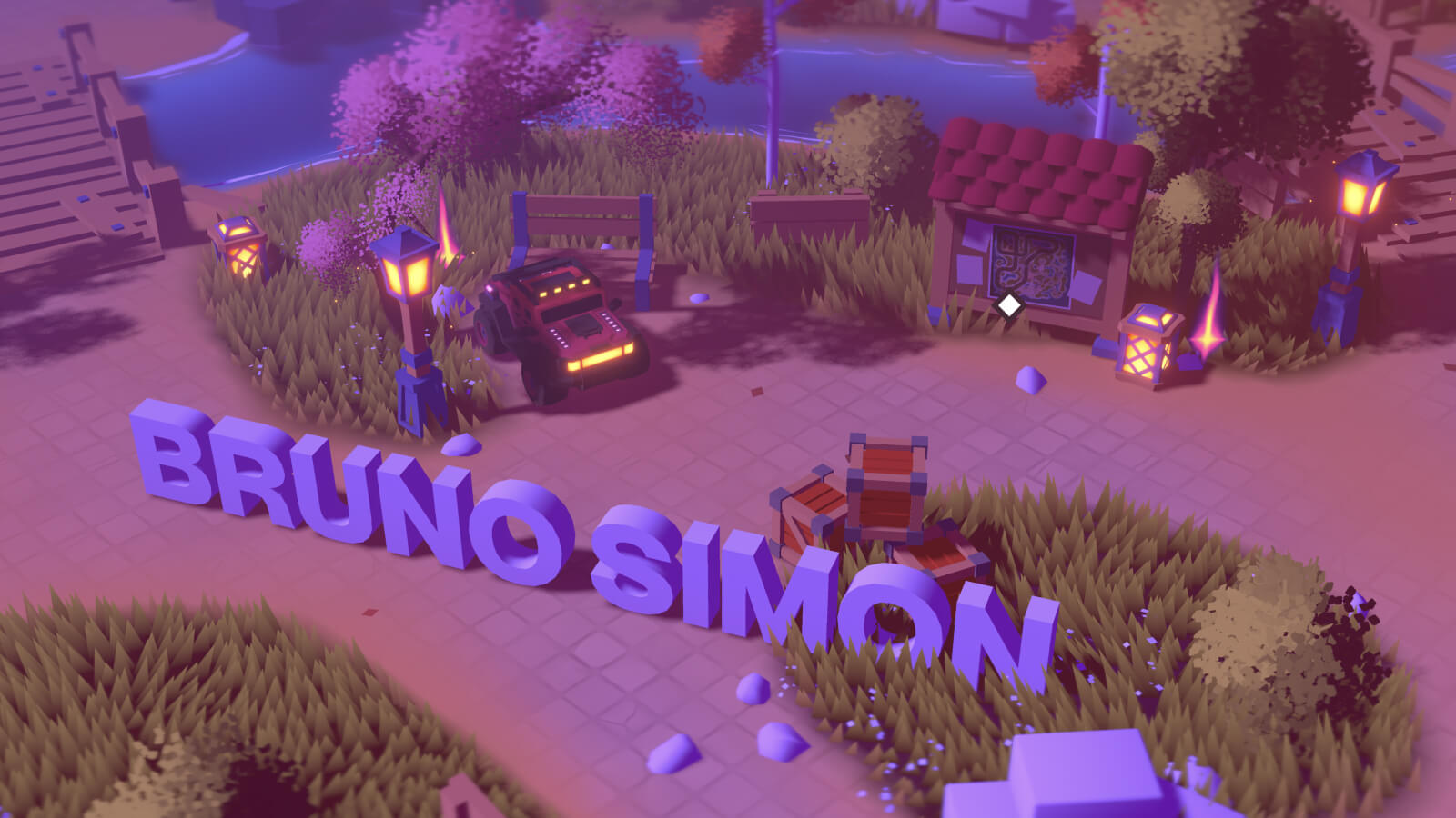
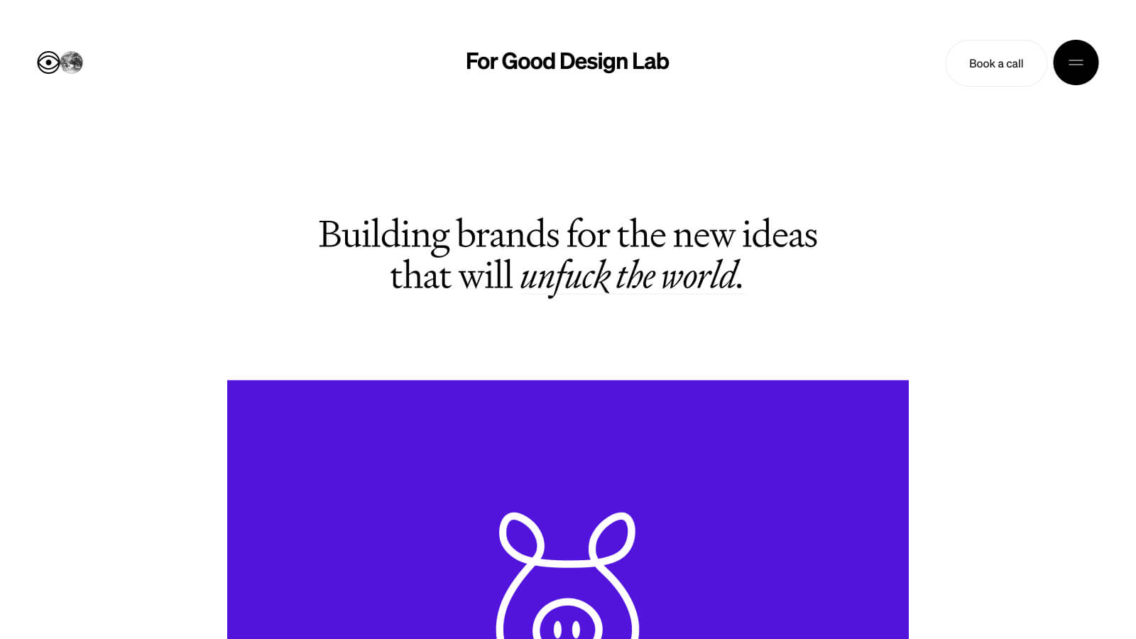
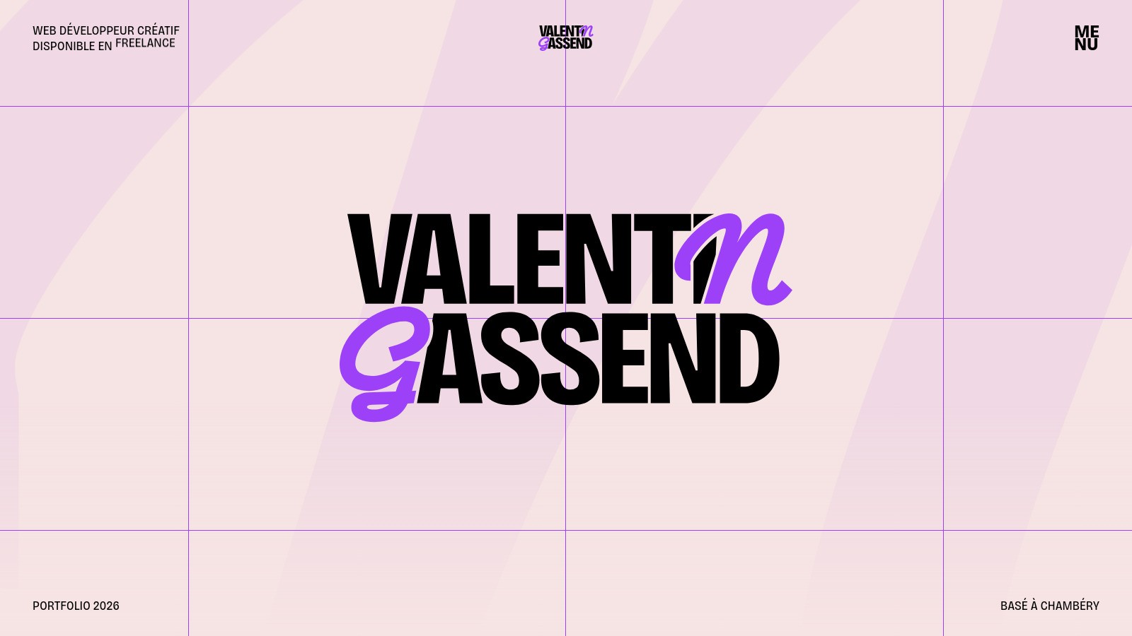
Green website design can feel restrained or highly expressive depending on its brightness and the colors around it. A muted green background behaves differently from a vivid accent on black. Rather than choosing a shade in isolation, decide which parts of the page should stay neutral and where green should lead. Consistency across headings, links, and project sections matters more than the number of shades.
Green websites worth studying
Olha Uzhykova combines muted green surfaces with darker text and pale interface elements. Felix Peault brings green into a broader gradient with blue and warmer light tones. One offers a quieter, surface-led approach; the other makes the background more expressive. Compare how each palette supports the typography before applying a similar color treatment to your own work.
Choosing lighter or warmer companions
Explore light green websites if you want softer backgrounds or brighter lime details. Beige website designs are another useful reference when building a warmer, more muted combination. Avoid using green as the only indicator of success or availability. Pair important states with clear text, and check the contrast of any colored label against the surface where it actually appears.