
Light green
The best Light green portfolio websites
Explore light green portfolio websites with mint, sage, and lime accents. A curated look at softer palettes and bright details in creative web design.
New portfolios in your inbox.
Light green
The best Light green portfolio websites
Explore light green portfolio websites with mint, sage, and lime accents. A curated look at softer palettes and bright details in creative web design.
New portfolios in your inbox.
Light green
The best Light green portfolio websites
Explore light green portfolio websites with mint, sage, and lime accents. A curated look at softer palettes and bright details in creative web design.
New portfolios in your inbox.


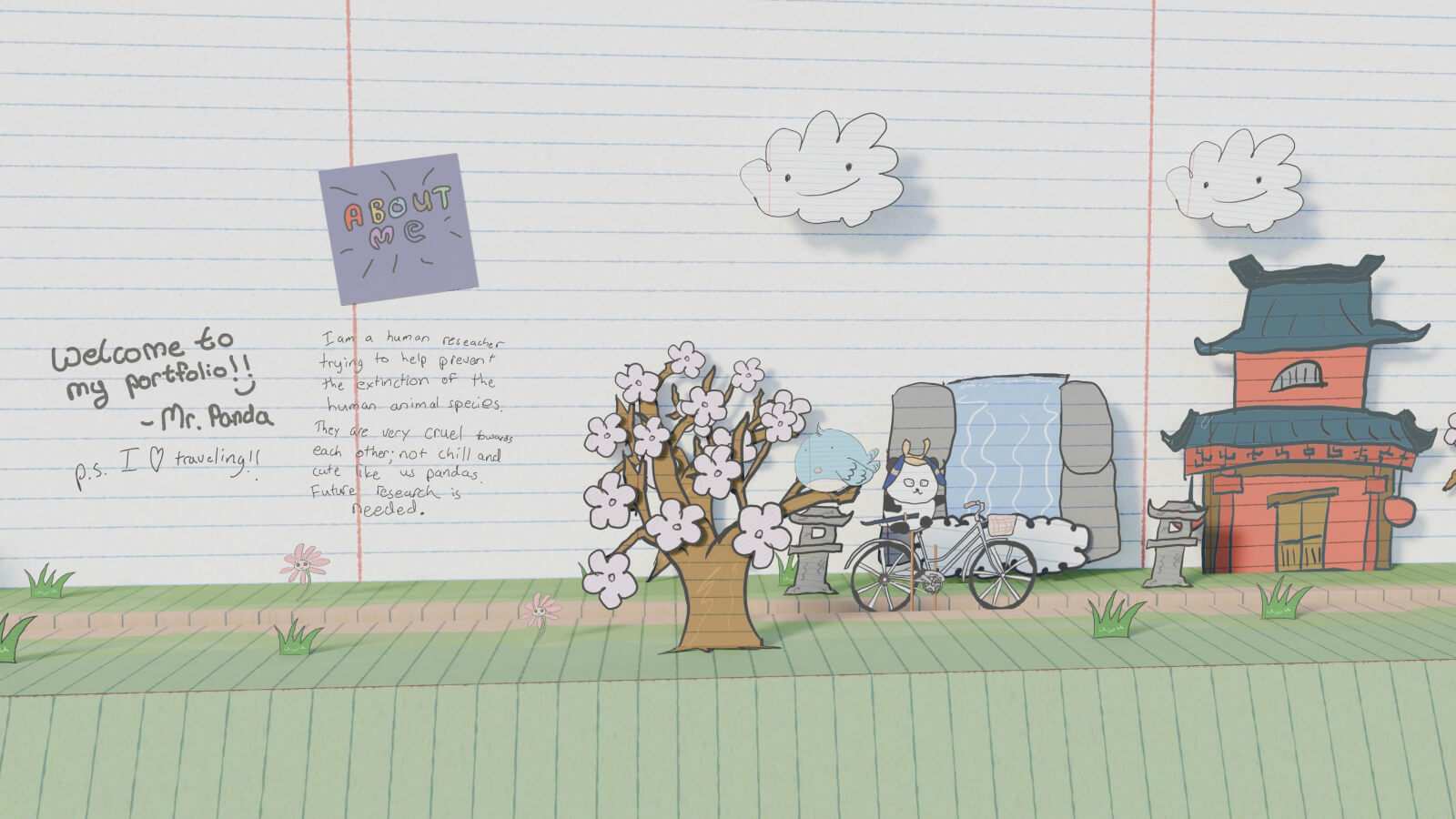


The range within light green website design
Light green is not a single mood. Muted sage can sit close to a neutral, while a bright lime accent can dominate the whole interface. When browsing these websites, notice whether the green forms the background, the typography, or a small interactive detail. Those choices tell you more about how to use the palette than the color name alone.
Light green websites worth studying
MOM pairs large pale-green lettering with a dark grey background, letting scale and contrast do most of the work. Eyekiller uses light green alongside pink in a predominantly black interface. Olha Uzhykova offers a softer direction through muted green surfaces. These examples are useful comparisons when deciding between a bright accent and a quieter overall atmosphere.
Pairing pale greens
Darker text usually gives pale-green backgrounds a clearer reading hierarchy. On a dark canvas, check that smaller green labels remain as readable as the headline. Browse green portfolio websites for deeper shades, or explore beige website designs for a warmer neutral companion. Keep decorative color separate from important interface states so visitors do not have to decode the palette to navigate.