
Pink
The best Pink portfolio websites
Browse pink portfolio websites, from soft accents to expressive creative palettes. Curated examples that make pink part of a considered visual identity.
New portfolios in your inbox.
Pink
The best Pink portfolio websites
Browse pink portfolio websites, from soft accents to expressive creative palettes. Curated examples that make pink part of a considered visual identity.
New portfolios in your inbox.
Pink
The best Pink portfolio websites
Browse pink portfolio websites, from soft accents to expressive creative palettes. Curated examples that make pink part of a considered visual identity.
New portfolios in your inbox.














Finding a useful role for pink
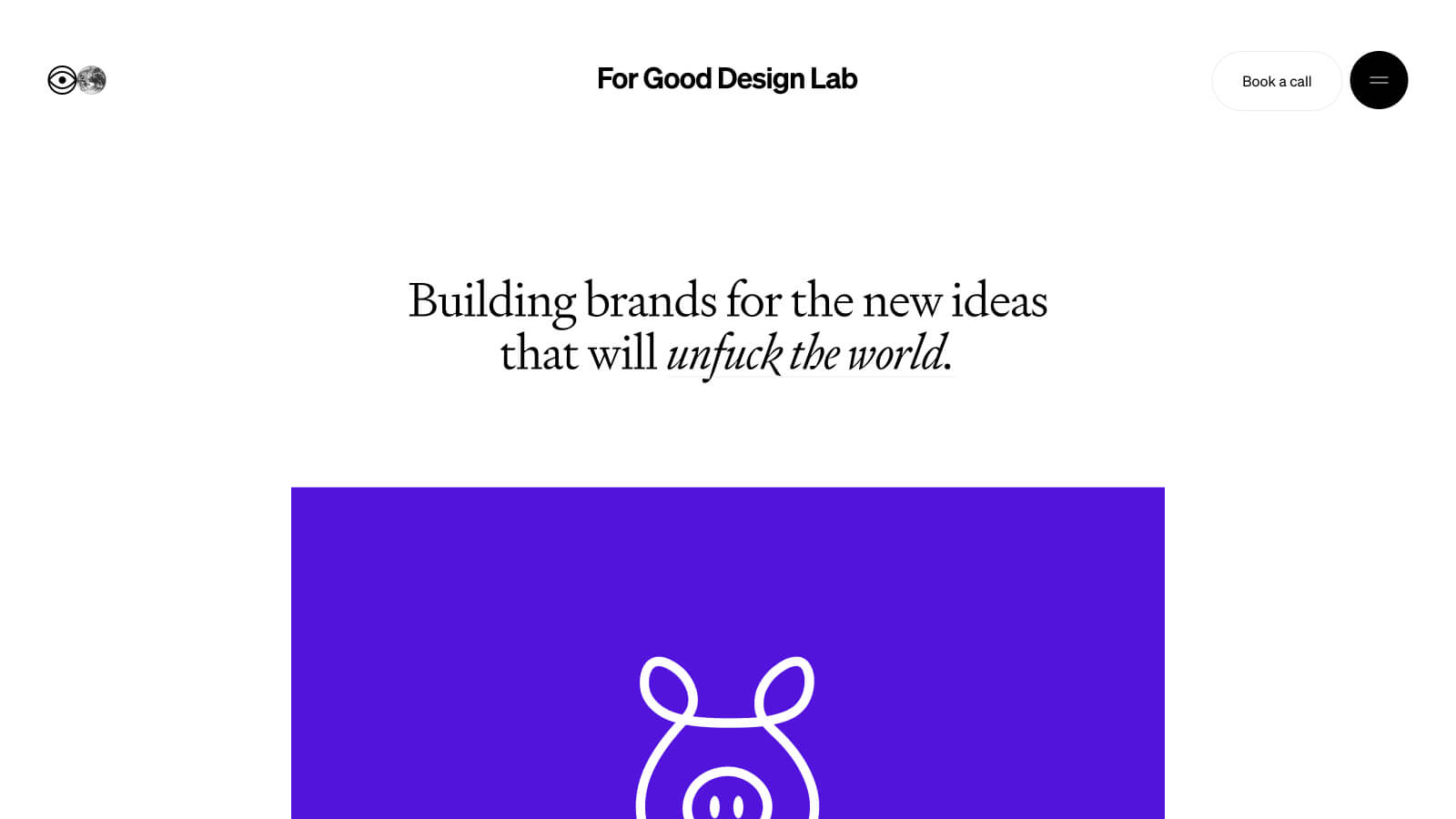
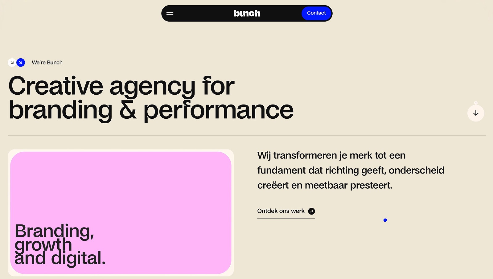
Pink website design does not need to follow one familiar style. Pale pink can soften a neutral interface, while a more saturated shade can anchor a headline or illustration. The surrounding typography and colors determine the result. Start with the content and the tone of the portfolio, then decide whether pink should provide atmosphere, contrast, or a specific point of emphasis.
Pink portfolios worth studying
Eyekiller combines pink lettering with light-green details on a black background. Poison Studio uses pink more sparingly within an otherwise dark, monochrome composition. The difference is useful: one treats pink as a prominent interface color, the other as a supporting visual detail. Notice how the surrounding white text keeps both compositions readable.
Choosing complementary tones
Pink can work alongside purple in a softer palette or with black for a harder contrast. Neither pairing needs to spread across every element. Compare purple websites for neighboring hues, or browse playful portfolios for related uses of expressive color. Test lighter pinks with actual body text and buttons, especially if the background is also pale. A distinctive palette should still make the next action obvious.