
Light blue
The best Light blue portfolio websites
A curated collection of light blue portfolio websites. Explore airy backgrounds, cool accents, and softer color combinations for creative websites.
New portfolios in your inbox.
Light blue
The best Light blue portfolio websites
A curated collection of light blue portfolio websites. Explore airy backgrounds, cool accents, and softer color combinations for creative websites.
New portfolios in your inbox.
Light blue
The best Light blue portfolio websites
A curated collection of light blue portfolio websites. Explore airy backgrounds, cool accents, and softer color combinations for creative websites.
New portfolios in your inbox.




Designing with light blue
Light blue website design can create space around the work without retreating to a completely neutral palette. It might appear as a pale background, a graphic detail, or one part of a broader color system. The best use depends on the content. A soft blue behind a dense case study needs different typography and contrast from a large illustrated landing page.
Light blue combinations to explore
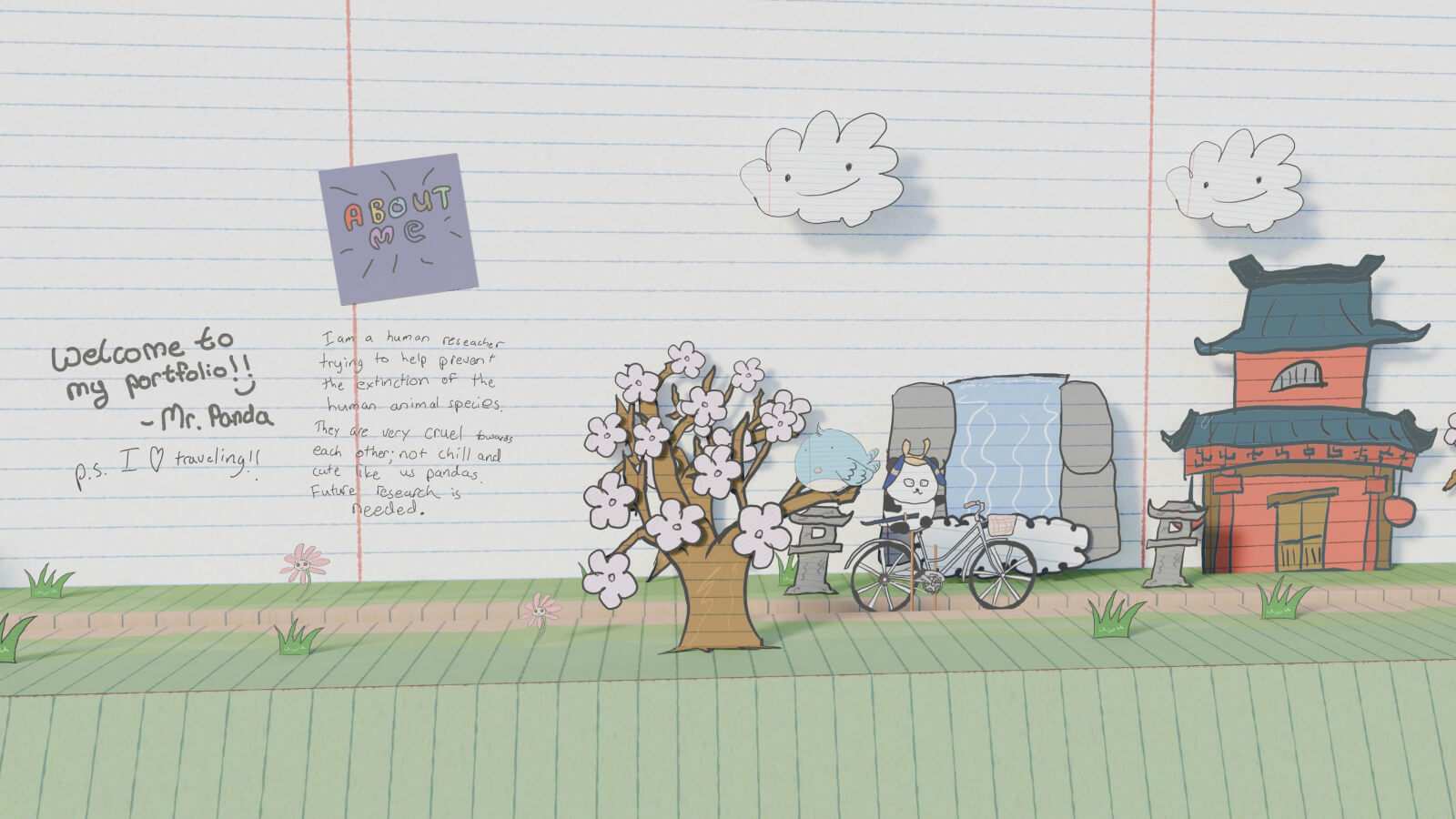
VIV is a useful reference for a palette that combines light blue with warmer neutrals. Mr. Panda brings pale blue into an illustrated environment alongside light green and paper-like surfaces. Compare the role of color in each: the first offers a palette relationship to study, while the second shows how softer hues can support a distinctive visual world.
Keeping pale blue clear
Use darker text for essential information and check that white cards remain distinct from their surroundings. If the result feels too faint, a stronger blue accent can introduce a more obvious point of focus. Browse blue portfolio websites for that contrast, or compare light green designs for another soft-color direction. Pale backgrounds still need clear link and button treatments; subtle should not mean difficult to use.