
Beige
The best Beige portfolio websites
Browse beige portfolio websites with warm neutrals and considered typography. Curated inspiration for creatives looking beyond a pure white background.
New portfolios in your inbox.
Beige
The best Beige portfolio websites
Browse beige portfolio websites with warm neutrals and considered typography. Curated inspiration for creatives looking beyond a pure white background.
New portfolios in your inbox.
Beige
The best Beige portfolio websites
Browse beige portfolio websites with warm neutrals and considered typography. Curated inspiration for creatives looking beyond a pure white background.
New portfolios in your inbox.


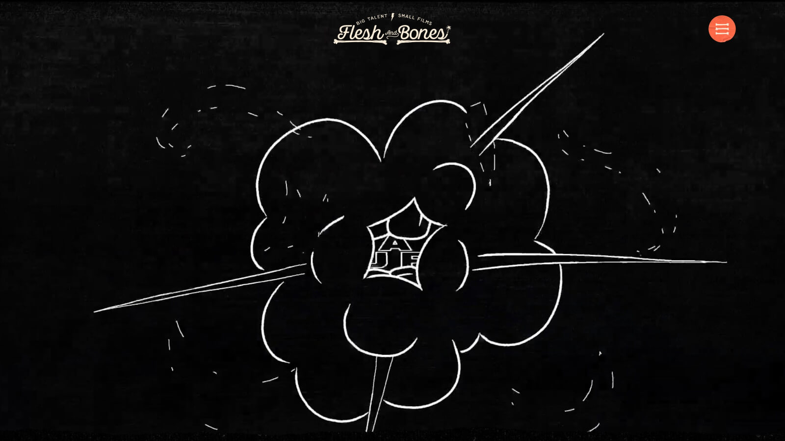




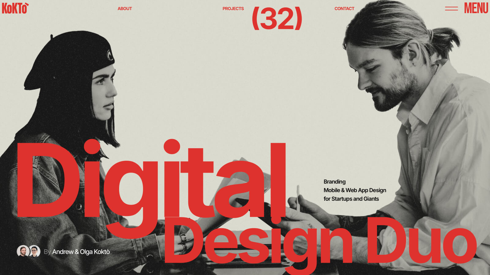
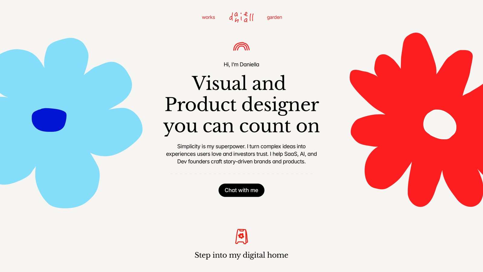





Working with beige in web design
Beige website design introduces warmth without necessarily making the interface colorful. It works as a page background, a text color on darker surfaces, or a bridge between photographs and typography. The challenge is keeping the palette from becoming flat. Strong examples use changes in scale, spacing, and contrast to create structure instead of relying on several almost-identical neutral shades.
Beige palettes worth studying
LxL Creative uses pale warm typography against brown, with orange adding a sharper accent. Hancore takes a different route, using beige details within a near-black interface. These examples show that a beige palette does not have to mean an entirely pale page. Look at how much contrast the supporting colors provide before choosing a similar combination.
Finding the right neutral
A small shift in hue can make beige appear yellow, pink, or grey beside photography. Test it with actual project images rather than an empty layout. Explore brown websites for a deeper warm palette, or browse elegant portfolios for related approaches to typography and spacing. Keep body text dark enough to read comfortably, especially when the background is textured or subtly tinted.