
Grey
The best Grey portfolio websites
Explore grey portfolio websites built around neutral palettes, typography, and texture. Curated examples of understated color with a clear visual hierarchy.
New portfolios in your inbox.
Grey
The best Grey portfolio websites
Explore grey portfolio websites built around neutral palettes, typography, and texture. Curated examples of understated color with a clear visual hierarchy.
New portfolios in your inbox.
Grey
The best Grey portfolio websites
Explore grey portfolio websites built around neutral palettes, typography, and texture. Curated examples of understated color with a clear visual hierarchy.
New portfolios in your inbox.


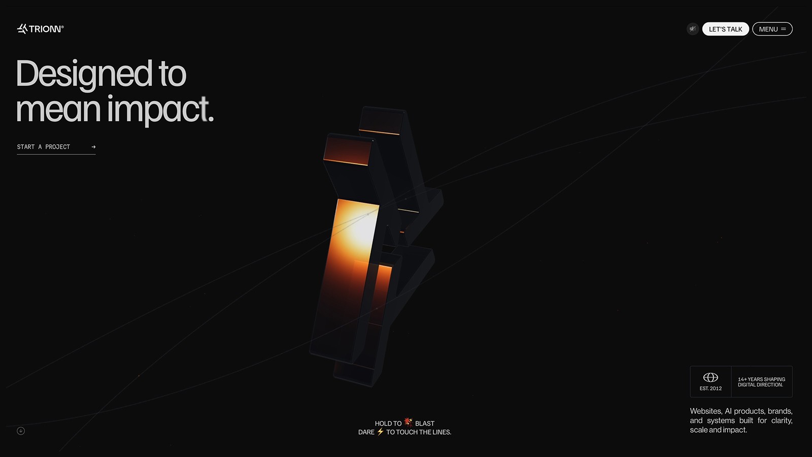


Grey does not have to mean flat
Grey website design puts the emphasis on tone rather than hue. That can make it a useful frame for varied project imagery, but it also leaves little room to hide weak hierarchy. Strong grey palettes distinguish the background, content surfaces, and text clearly. If every element sits at a similar brightness, the page can feel indistinct even when the layout is carefully arranged.
Grey websites worth studying
Monolog builds a dark, textured atmosphere with a range of neutral tones. Richard Ekwonye uses a lighter grey foundation with strong black typography. Comparing them shows how widely a neutral palette can vary. Pay attention to the size and weight of the lettering as well as the background, because the contrast comes from all of those choices together.
Choosing a tonal range
Pick a small set of greys with distinct roles before adding extra shades. Browse light grey websites if your priority is a pale canvas, or dark grey designs for a darker interface. Typographic portfolios offer another useful reference when the text needs to carry the identity. Check secondary copy carefully; medium-grey text can disappear on a background that initially looks quite different.