
Blue
The best Blue portfolio websites
Discover blue portfolio websites, from vivid studio identities to restrained interface accents. Curated web design inspiration for your next creative project.
New portfolios in your inbox.
Blue
The best Blue portfolio websites
Discover blue portfolio websites, from vivid studio identities to restrained interface accents. Curated web design inspiration for your next creative project.
New portfolios in your inbox.
Blue
The best Blue portfolio websites
Discover blue portfolio websites, from vivid studio identities to restrained interface accents. Curated web design inspiration for your next creative project.
New portfolios in your inbox.











Finding the right role for blue
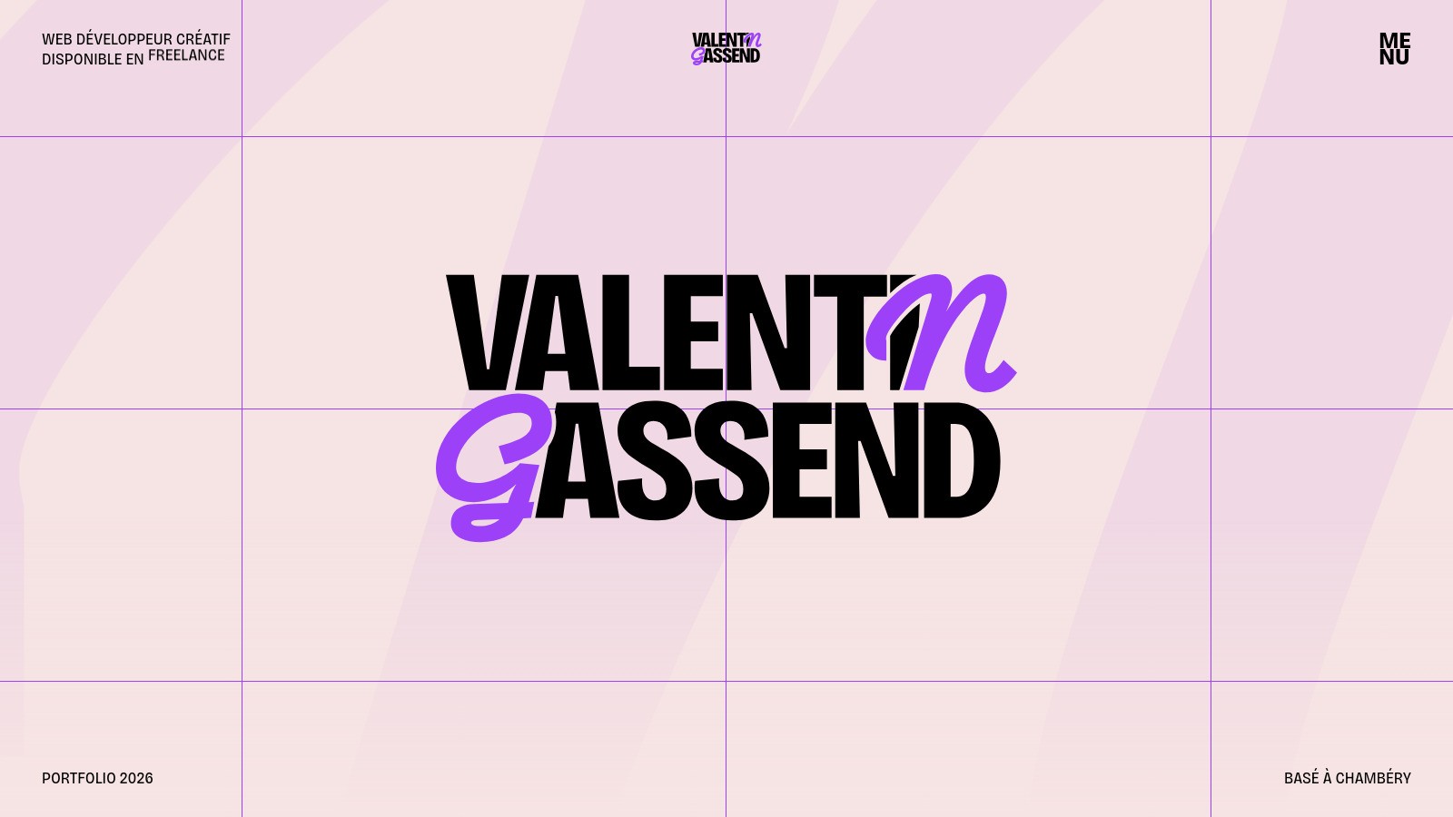
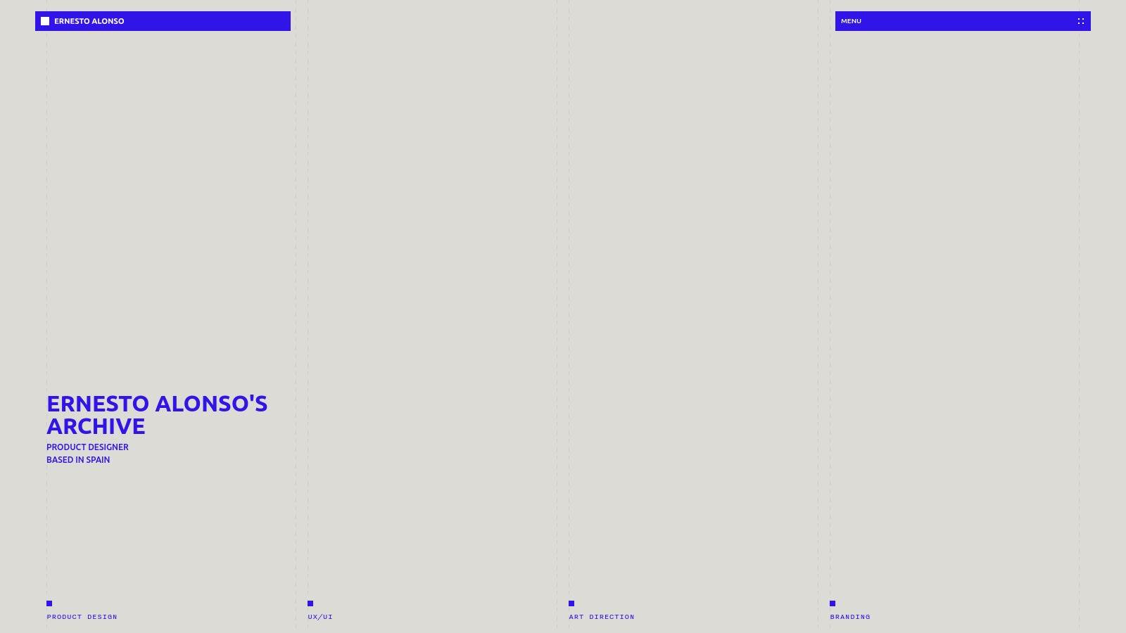
Blue website design can be quiet or deliberately loud. A small blue link creates a different impression from an electric-blue background covering the screen. Decide which job the color needs to do before building the rest of the palette. A useful starting point is one dominant shade, a neutral foundation, and a consistent treatment for actions. More shades do not automatically create more depth.
Blue websites worth studying
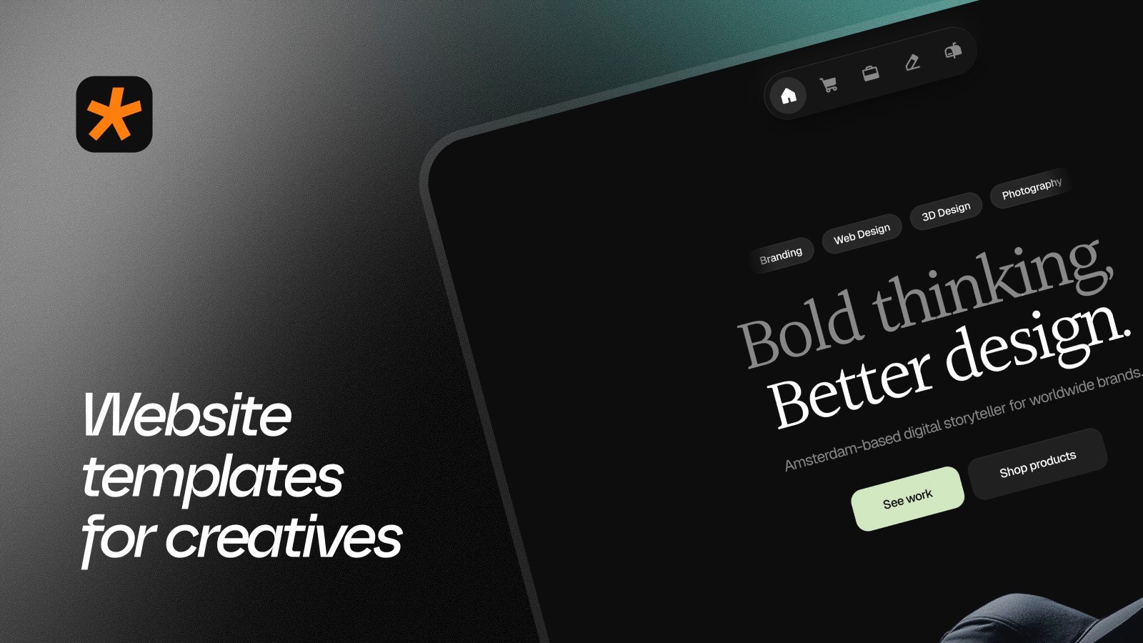
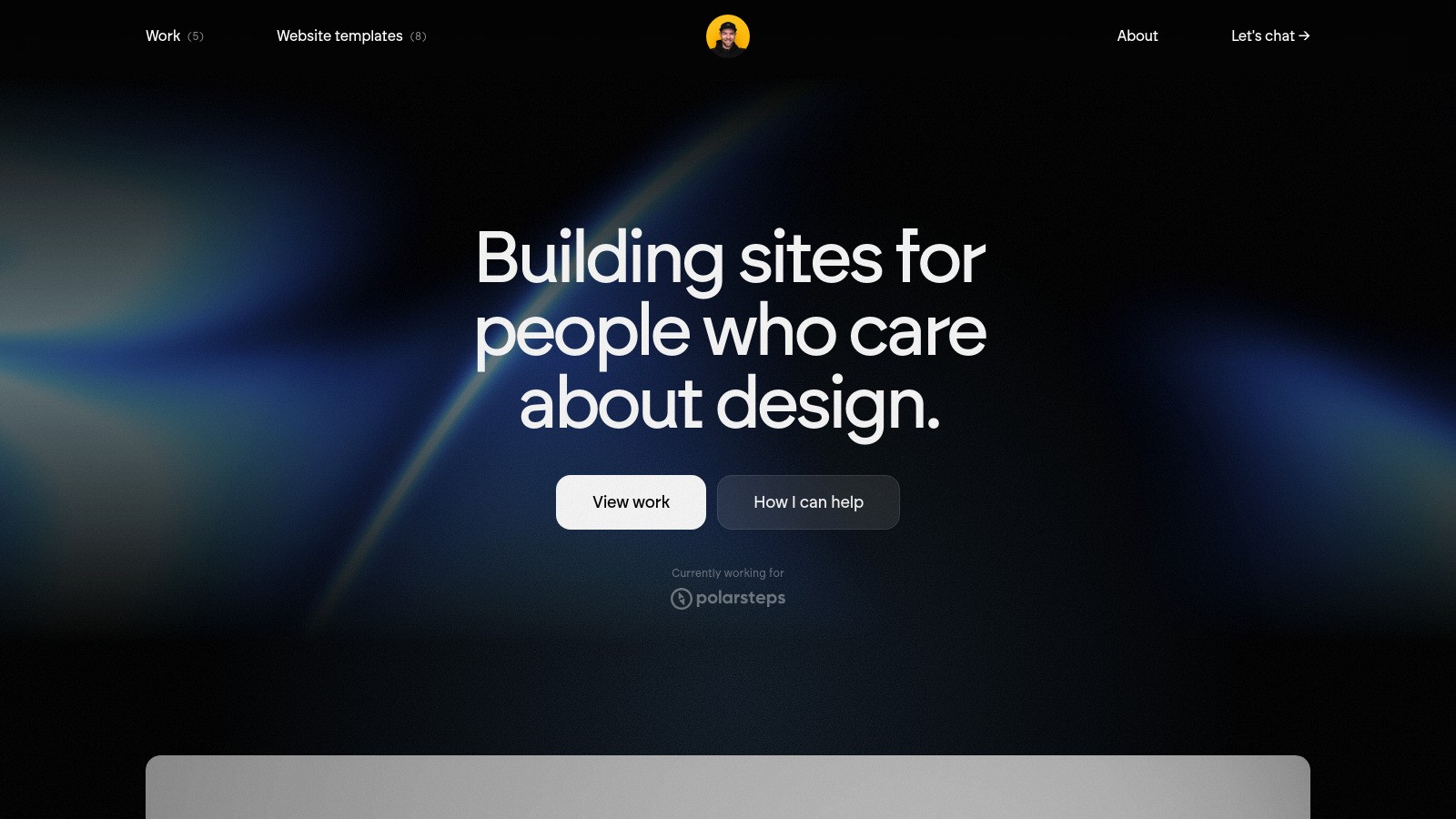
Catalyst Design Lab places a blue visual against a dark interface, making the accent easy to notice without spreading it everywhere. Leeroy takes blue across much more of the screen. Comparing the two helps distinguish an accent-led palette from a color-led identity. Pay attention to the surrounding black and white areas, which give the blue its contrast.
Pairing blue with other colors
White can make a blue palette feel crisp; black can make it more intense. For a softer starting point, browse light blue websites. If you are interested in the stronger end of the spectrum, explore bold portfolios. Check links and buttons against their actual backgrounds, especially when blue appears in gradients or behind smaller text.