
Purple
The best Purple portfolio websites
Discover purple portfolio websites, from soft lavender details to vivid creative identities. Curated inspiration for using purple with purpose.
New portfolios in your inbox.
Purple
The best Purple portfolio websites
Discover purple portfolio websites, from soft lavender details to vivid creative identities. Curated inspiration for using purple with purpose.
New portfolios in your inbox.
Purple
The best Purple portfolio websites
Discover purple portfolio websites, from soft lavender details to vivid creative identities. Curated inspiration for using purple with purpose.
New portfolios in your inbox.













Choosing a direction for purple
Purple website design covers very different visual territory. Lavender can behave like a soft supporting tone, while a deep or saturated purple can define an entire page. Choose the role first, then the shade. A portfolio built around colorful work may need less purple in the interface than one where the typography and background create most of the identity.
Purple portfolios worth studying
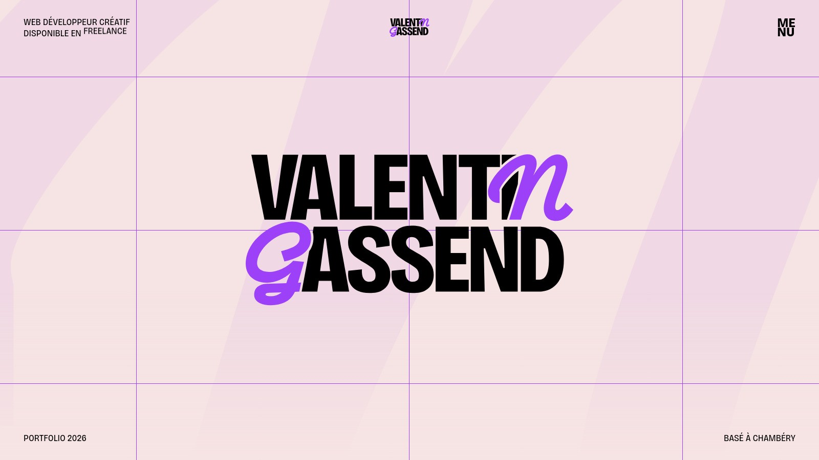
YKWMI Studio uses a purple-led background with pale typography, making color part of the opening impression. Montone takes a lighter approach through a pale purple gradient and restrained details. Hipuku includes purple within a multicolor wordmark. Together, they offer three different scales of commitment: a dominant background, a soft surface, and a concentrated graphic accent.
Supporting the main color
Black and white can anchor purple, while neighboring pink or blue tones can extend a gradient. Keep the brightest transitions away from small text unless you have tested legibility throughout. Explore pink website designs for a warmer pairing, or browse experimental portfolios for less conventional compositions. The goal is a consistent visual direction, not simply adding a gradient wherever there is empty space.